We all know that websites are important to businesses. How else would brands make consumers aware of their offerings from anywhere in the world?
Businesses might make design decisions on their websites to put their best-selling product on the homepage or make the navigation bar a color that aligns with their branding. But design decisions impact more than just the business – they build an experience for the user.
In the article Combining UX design and psychology to change user behavior, UX designer Megha Goyal explains that “When we take in consideration human behavior, attitudes, and moods, we realize that there is more to design. It’s not only about creating the most attractive user experience. It’s about understanding the users and their needs.”
Consumer needs and emotions arise from every decision made on a website, big or small, and that’s why it’s important to be intentional with user experience and user interface design.
So what are UX and UI?
According to the UX Design Institute, user experience (UX) relates to how a user feels whenever they interact with a product or service. “It’s not a physical, tangible thing—it’s the case and user friendliness of the interaction as a whole.”
On the other hand, user interface (UI) relates specifically to the screens, buttons and other visual and interactive features a person uses to interact with a digital product, such as a website or app.
Feel/need statements are used to understand how the UX and UI of a specific product, service, device, feature, etc. impacts users. These can help designers make design decisions based on how consumers feel from existing interfaces.
Feel/need statements in the real world
To see how these feel/need statements can be used in real-world situations, I analyzed two competing websites and compared how certain overlapping features made me feel based on my needs.
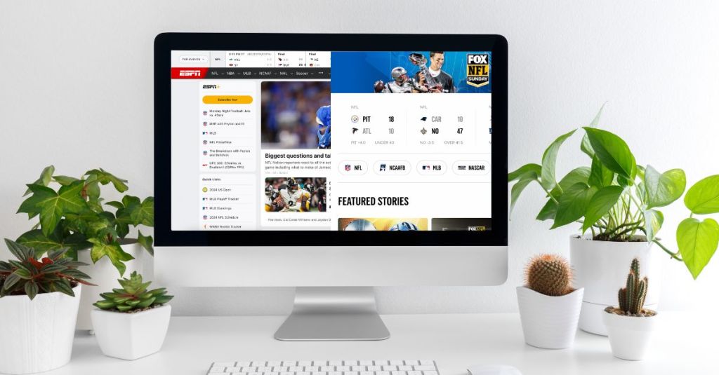
ESPN and FOX Sports are two of the most popular sports programming networks in the country, if not the world. Both networks provide sports fans with scores, live streams, broadcasts, articles, videos, and tons more content to consume daily. However, each network’s website provides a different user experience and user interface for sports fans to interact with.
I wrote feel/need statements for several features of each website to compare the user experience that these interfaces provide. Here are two examples for ESPN, and two examples for FOX Sports:
ESPN navigation bar
The ESPN navigation bar makes me feel content and satisfied because my need for clarity and ease of use is being met. It’s nice that all the major leagues are on the bar, the rest of the less popular leagues are accessible within a dropdown, and the nav bar stays fixed to the top of the page as a user scrolls.

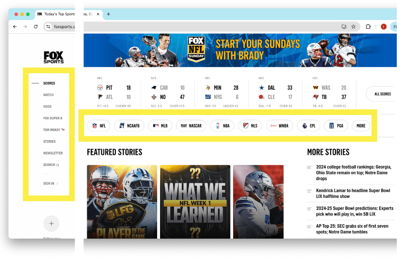
FOX Sports navigation bar
The FOX Sports navigation bar makes me feel uncomfortable and confused because my need for clarity and ease of use are not being met. There are essentially 2 nav bars within the homepage, and that makes it confusing to know where to click if I’m looking for specific information. The league nav bar runs across the top but doesn’t stick as I scroll. The nav bar with the rest of the site information runs down the side of the page, which takes a bit of getting used to.
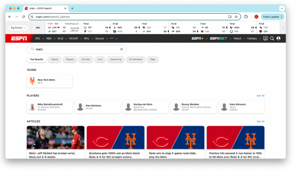
ESPN search page
The ESPN search page makes me feel content and satisfied because my need for choice and ease of use are being met. Once I put in a search, the results page is very aesthetically pleasing and I love that it gives me options for the types of content I want to consume. I also love that the results are sorted into different categories for ease of use, such as teams, players, articles, streams, videos, etc.
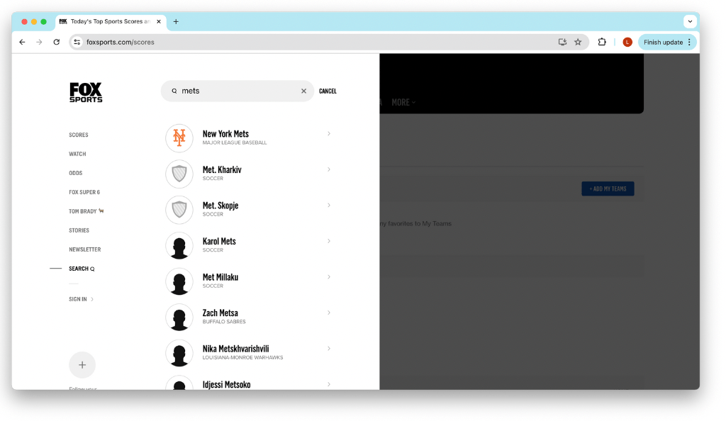
FOX Sports search popup
The FOX Sports search popup makes me feel satisfied but a bit confused because my need for creativity is being met but my need for organization is not being met. The way the search popup animates in is so satisfying and it created such a positive user experience for me. However, the fact that a search goes through without having to press enter, and that all the search results show up in one section without organization by team, league, players, etc. is a bit confusing.
To view all the feel/need statements I wrote based on the two websites, click here.
Even in websites that exist for the same reason, differences in UX and UI design have a major impact on user behavior, thus driving results for businesses. Next time you consider designing a website or even just visiting one, think about how each page or feature makes you feel, and what needs it addresses.

Leave a comment